While we can’t say with certainty that these films are any good, we can say with complete confidence that these are likely to go down as some of the worst posters of the year.
Was there a memo this week stating that all new posters have to feature foggy, hard-to-decipher images? Are bad photoshop blurs now mandatory? Do posters have to be so dark that you can’t quite tell what’s happening? And if there is any light, does it have to be a streak from the top right corner?
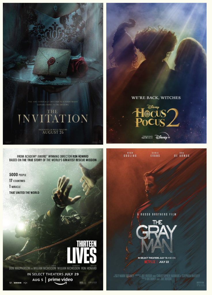
Seriously, do any of these posters make you want to see the movie?
We’re especially disappointed in you, Disney. HOCUS POCUS 2 is one of the year’s most anticipated films, and all we get is this muddy, silhouetted teaser that makes us less interested than before the poster came out.
It wasn’t all bad this week. Not only did we get a fantastic trailer for Lena Dunham’s SHARP STICK, but we got this striking one-sheet that captures the awkwardness of a teenager’s sexual awakening. Hair clips? Check. Seductive yet uncomfortable pose? Check. Floral print mattress? Check. Title in bold yellow font with one clear, impactful quote? Check.
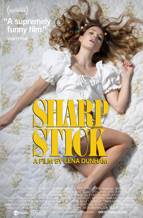
This is how you design a poster.
 © 2024 The Quorum, LLC, All Rights Reserved.